Work
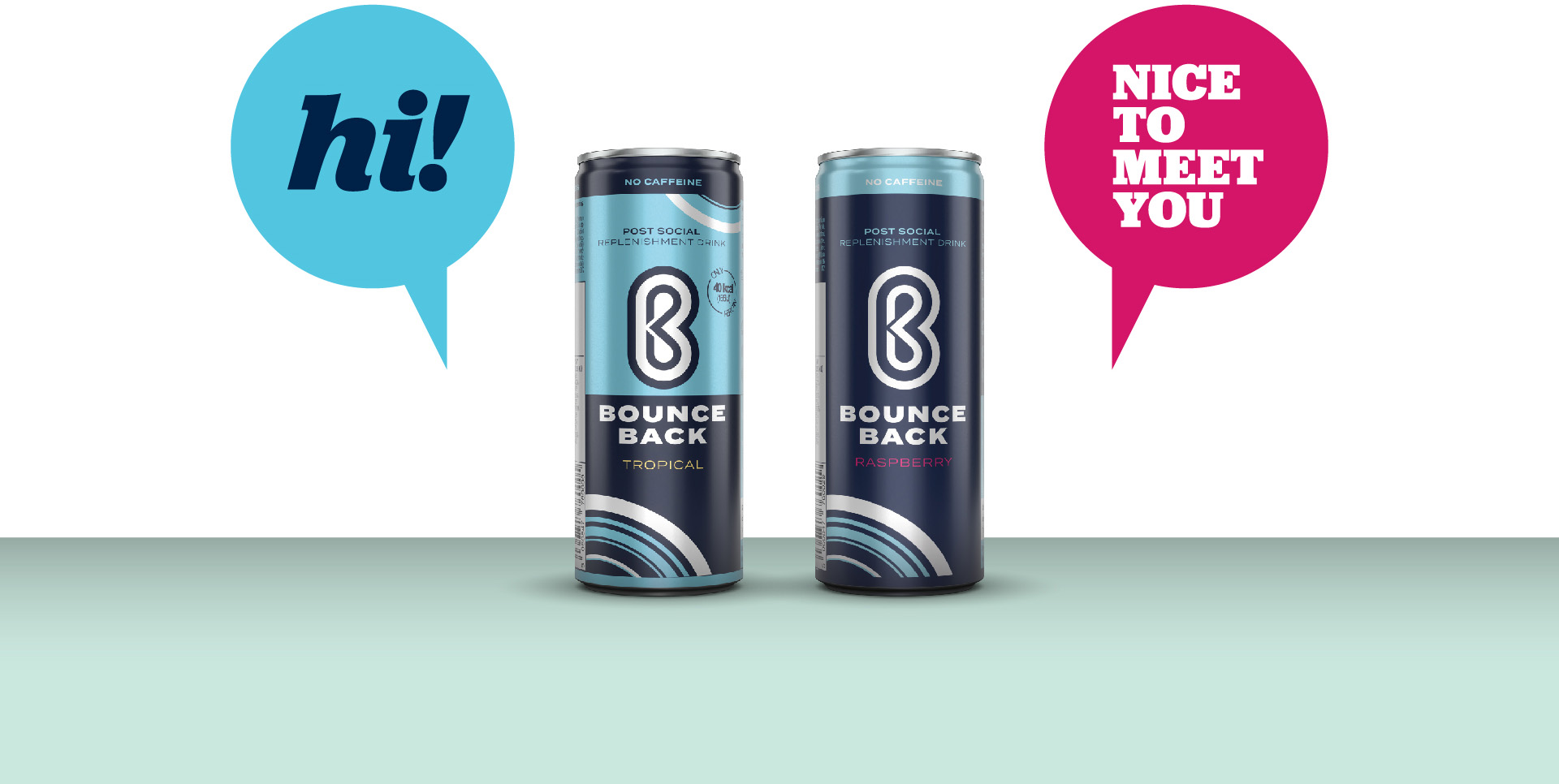
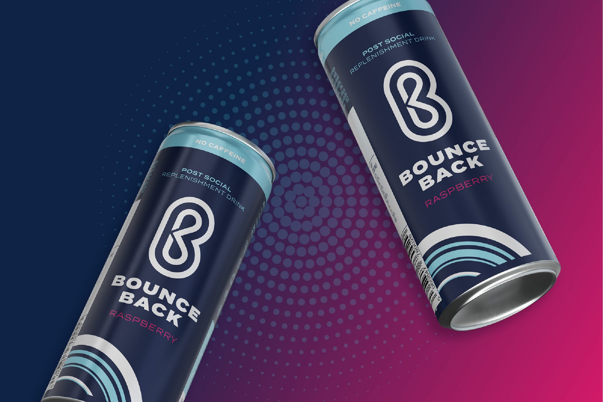
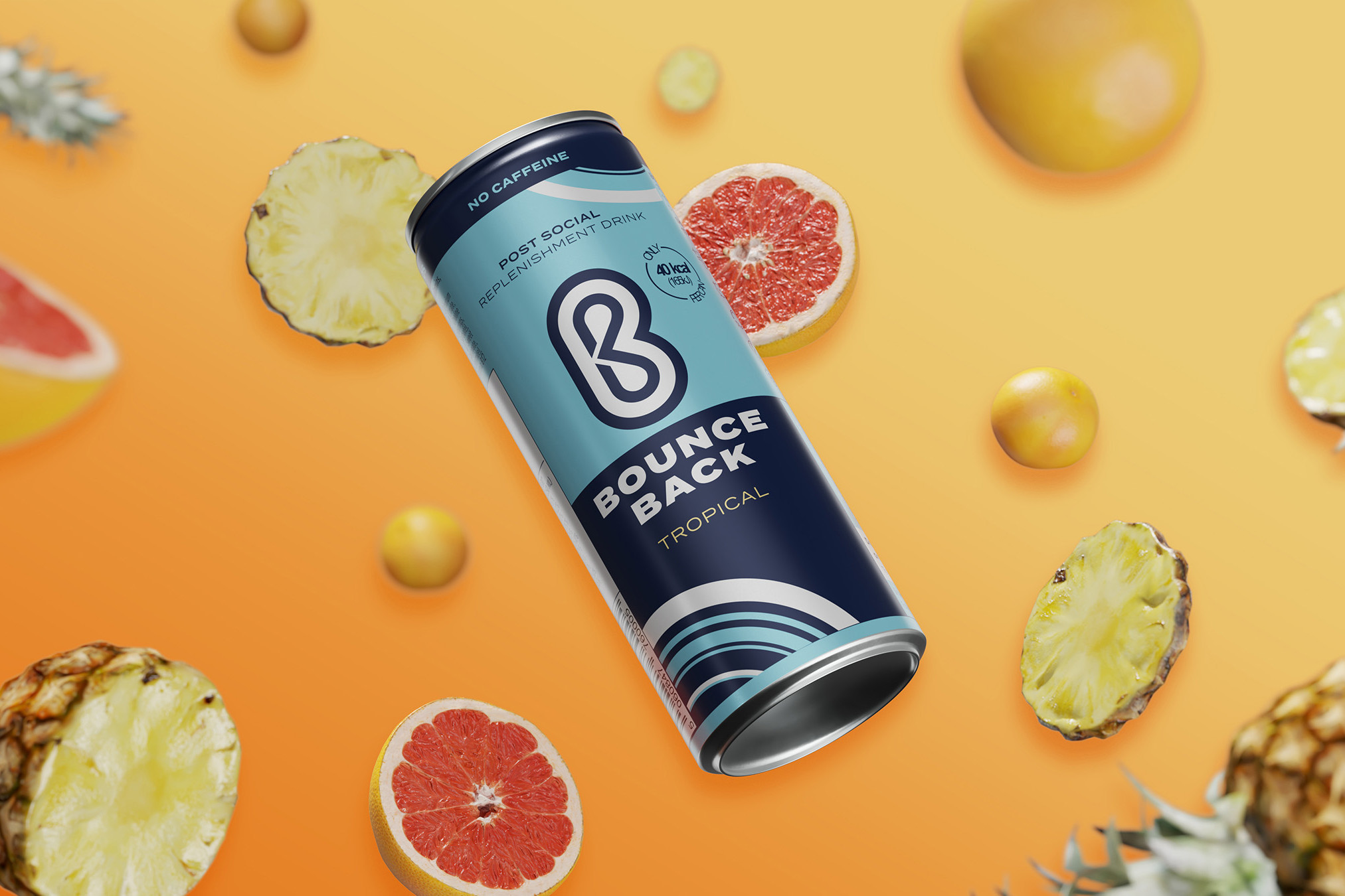
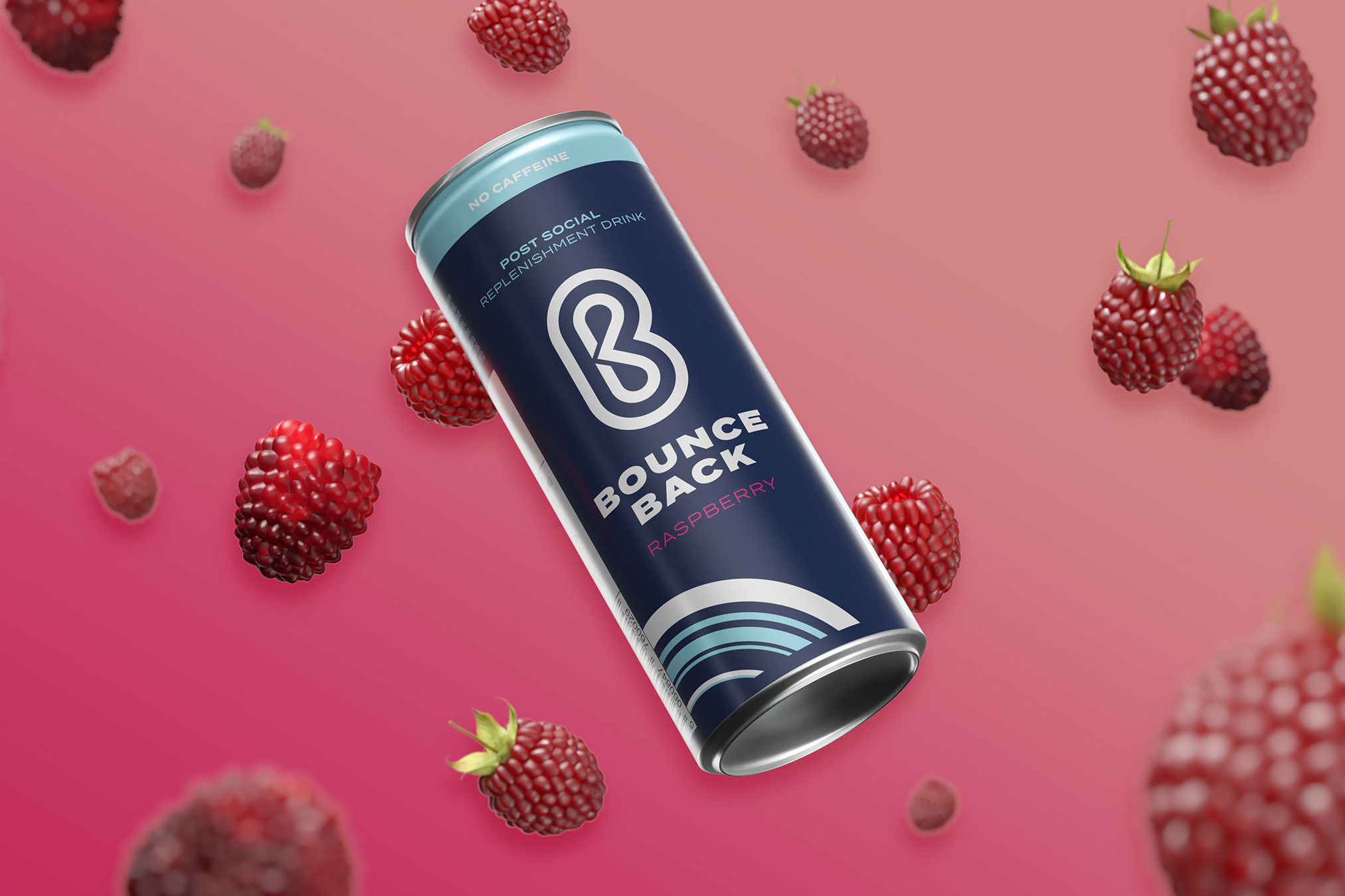
Bounce Back Rebrand
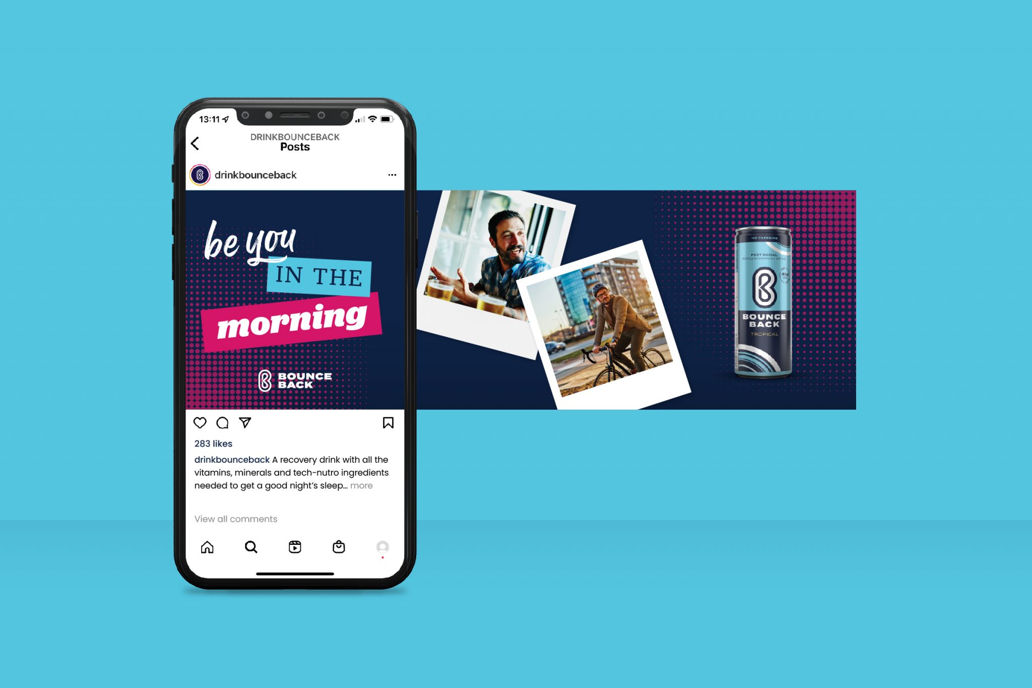
Bounce Back is designed to reduce the effects of alcohol on the body. But, and this is a big but, it’s not a hangover cure – or at least we weren’t allowed to say it is.
So we had to create a character that strongly hints at what the product does, without getting into specifics (bending the rules, not breaking them).

The Brief
Bounce Back is a brilliant product. But its marketing so far had fallen short of the mark – unclear and inconsistent, never quite getting the message across. We needed to start from scratch. Cutting through all the legal restrictions. Delivering a creative approach that let the world know just how good it is.
Getting Started.
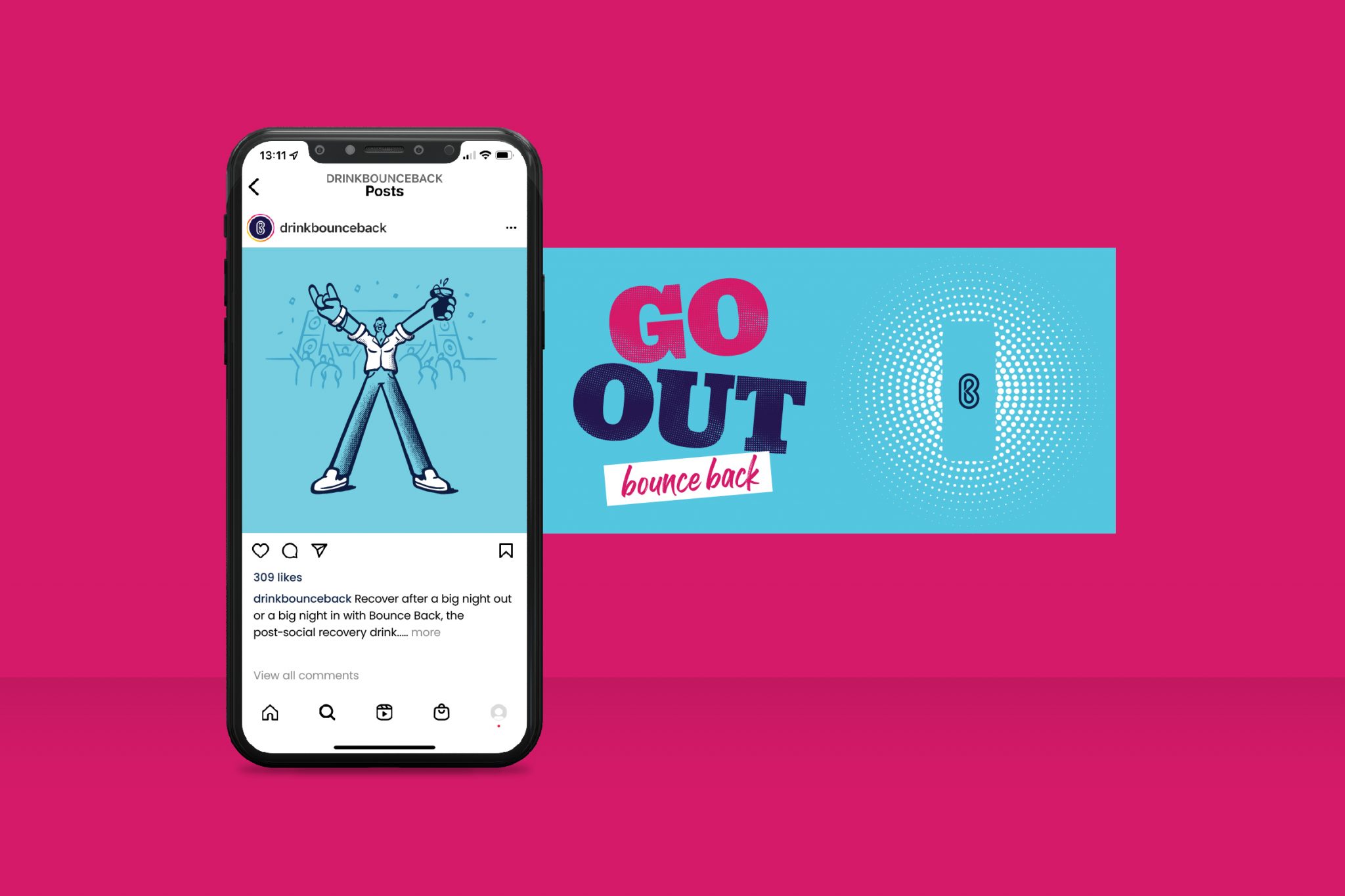
Bounce Back needed a personality. It had to speak clearly, but also had to let its mischievous side out to play.
Research showed the main target market was being missed. So we created key messaging that spoke directly to the people most likely to purchase. Messaging sorted; a creative style fell naturally in place.
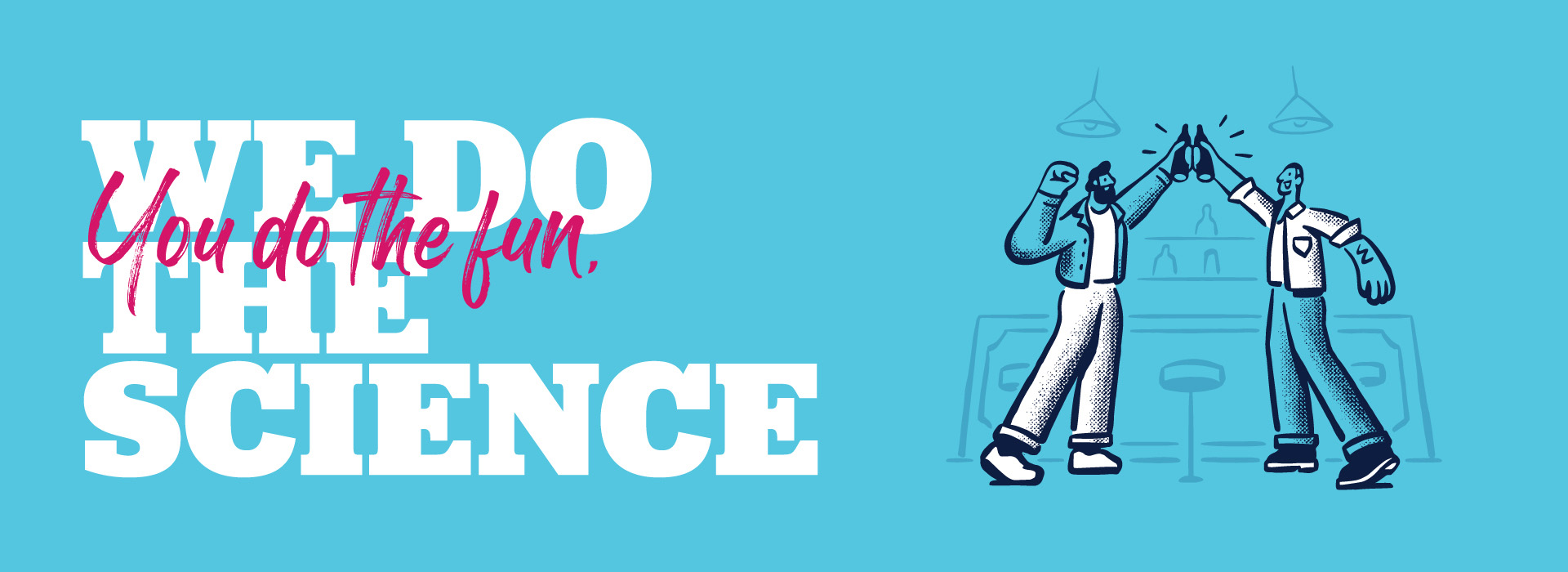
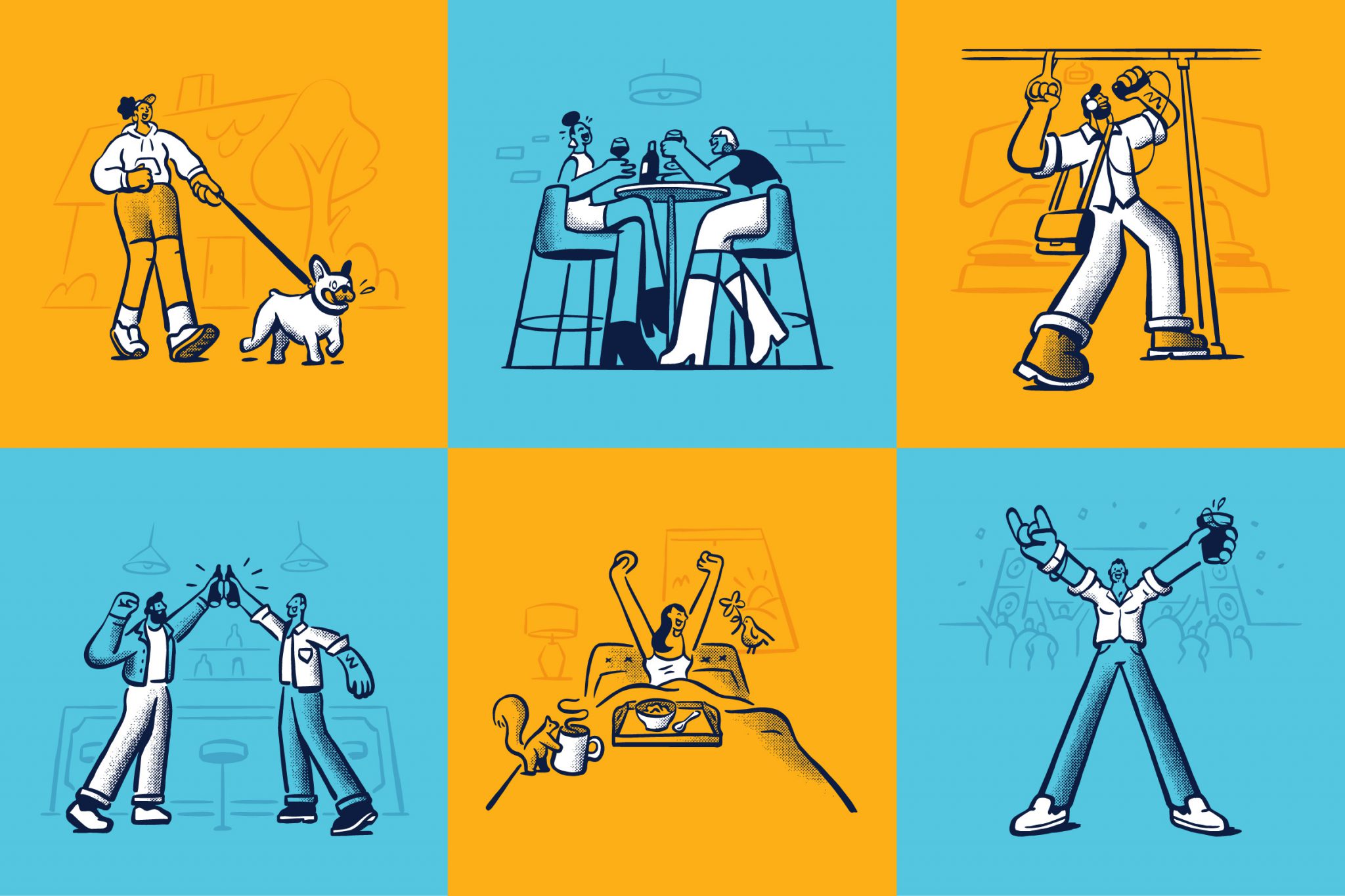
Illustrations.
Health legislation puts you in a bit of a straightjacket when promoting products linked to alcohol. This set of funky illustrations allowed us to push the boundaries, have a bit of fun and let the brand off the leash.
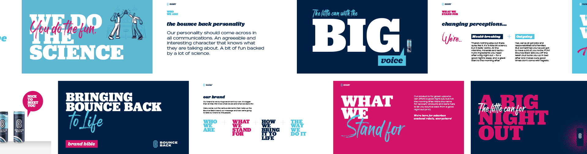
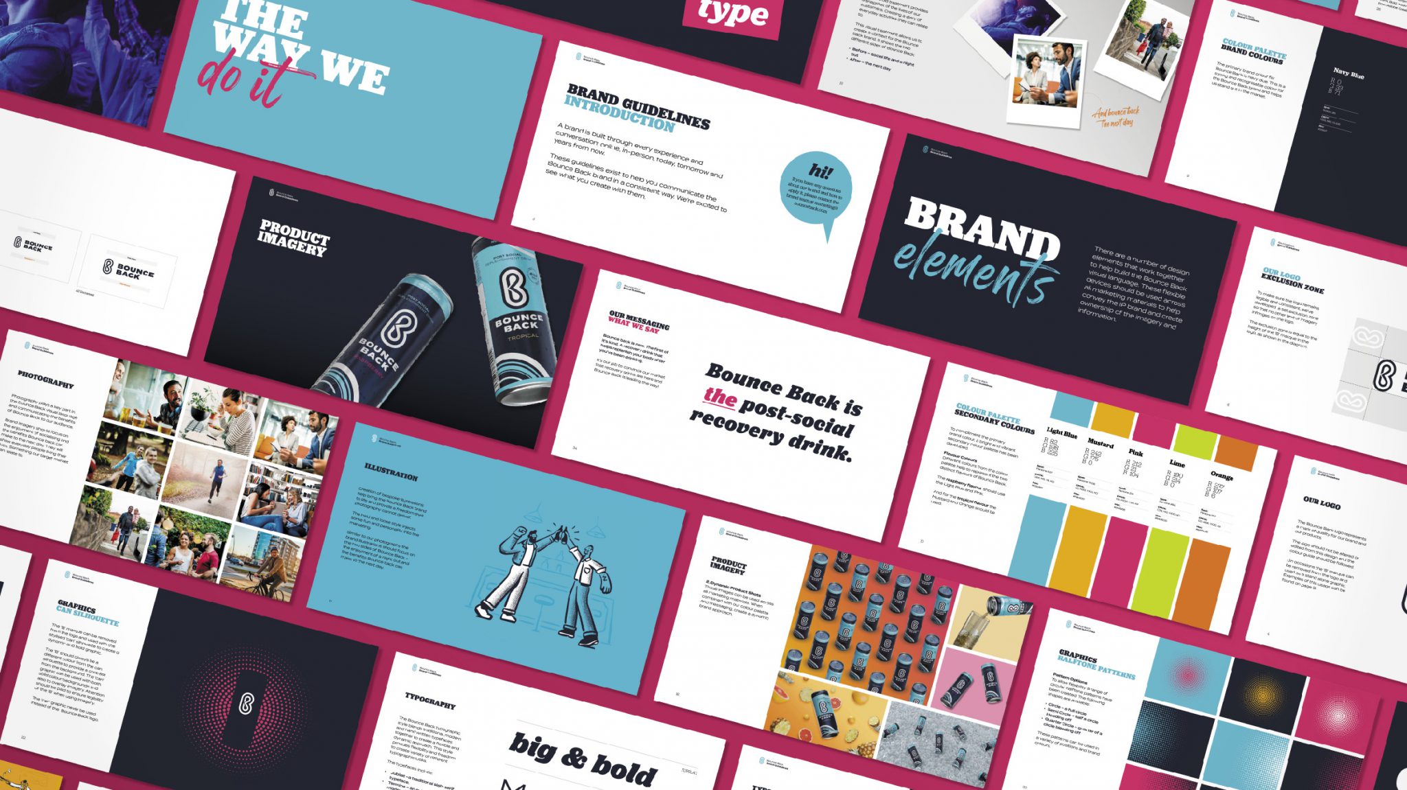
Brand bible and guidelines.
We created guidelines that cover Bounce Back’s ethos and how to use the tools we created, for consistent and impactful marketing. They keep the brand in check so it doesn’t stray, becoming either too dry or too whacky.